
What I will be covering
In this article, I will show you how easy is to integrate Bootstrap in your Drupal 7 website. There are several good modules our there, and a good theme that will bring in all the necessary styles and template overrides.
Why should I use Bootstrap?
In the old days people used to start websites from scratch. That meant creating your button styles, column grids, and custom JavaScript helpers. Bootstrap made it super easy to kick off a website with minimal CSS experience. Not only that, it's built so well that it enables more experienced web developers to customize it very easily. It's the foundation to any good website.
A big percentage of internet users now view sites on their mobile devices or iPads. Thus, here at Ascend, we always think about how the user will experience our customer's website on different screens. It's a key in today's market. We don't develop separate mobile sites anymore, because it will be impossible to design for every screen size. That's where Bootstrap's most popular feature comes in to play: Bootstrap's grid system, enabling developers to easily create responsive website layouts that adjust automatically depending on your screen size.
The Theme
Install LESS for Drupal 7
LESS CSS is a great way to write clean and reusable CSS. This will enable you to create your own theme deriving by the Bootstrap 3 on by changing a few variables.
- Install the LESS module
- Download and unpack the less php library so that
lessc.inc.phpis located insites/all/libraries/lessphp/lessc.inc.php - Enable the module
Install jQuery Update
Drupal 7 by default comes out of the box with a pretty outdated version of jQuery. The jquery_update module will enable you to easily upgrate to the latest version, which is also required by Bootstrap 3.
- Download and enable the module.
Download the Bootstrap 3 theme
Now, you could go out to the Bootstrap website and download the source code, and create your own theme, fortunately though, someone did it for you, and did it well! The Bootstrap 3 theme comes with all the necessary files, in addition to Drupal 7 specific template overrides for menus, views, grids, and more.
- Download the latest and stable version of the Bootstrap 3 Drupal 7 theme.
- Unpack it under
sites/all/themes/bootstrap - Enable the theme
Create a sub-theme
Drupal 7 enable you to create themes based on other themes. Create your own sub-theme:
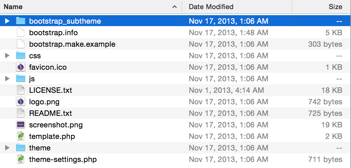
- Copy
boostrap_subthemeundersites/all/themes/boostrap to sites/all/themes/[your_theme_name] - Rename
bootstrap_subtheme.info.starterkitto[your_theme_name].info - Open up the .info file and replace the theme name with yours
- Enable your theme under Settings -> Appearance
Customize
You can now customize the Bootstrap theme by just overriding the variables (check out less/variables.less for a list of them) by adding them in the less/overrides.less file.
If you want to add more less files to create a better structure, just import them via the style.less file.
For example, at Ascend, we structure our themes in the following format, which makes it very clean:
- less/
- blocks/
- block-contact-form.less
- [...]
- content-types/
- blog-article.less
- [...]
- media/
- phones.less
- tablets.less
- desktops.less
- theme/
- html.less
- regions.less
- button.less
- [...]
- views/
- view-blog.less
- view-testimonials.less
- [...]
- blocks/
Drupal Bootstrap modules
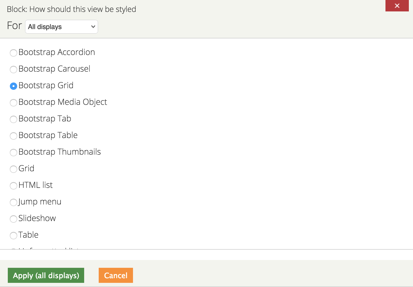
Views Bootstrap
Want to create a view of content in a columned way? Or perhaps create a list of content separated using Bootstrap's tabs? This is the module for you. views_bootstrap add several views output formats. See below for all the available options:
Block Class
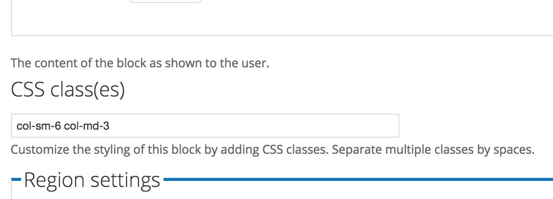
Although this module wasn't built specifically to integrate with Bootstrap, it's useful because it enables you to add classes to blocks. I found this extremely beneficial for creating theme regions meant to contain columned content. For example, create a region called content-columned, and create a block template override in [your_theme]/templates/region--content-columned.tpl.php with the following code:
<?php if ($content): ?>
  <div class="<?php print $classes; ?> row">
    <?php print $content; ?>
  </div>
<?php endif; ?>
That code will add the row class to enable columns. Now, every block you add to this region, you can specify a Bootstrap grid class (e.g. col-md-6) to enable your blocks to be columned or stacked depending on the device width.