There is a fine balance between the artist and design world. The work of creatives has overlapped since the beginning of time: from the very first cave drawing to the creation of Helvetica, art and design have always been connected.
Art can take on many forms: architecture, dance, sculpture, music, painting, and poetry. As society has progressed, so has our artwork. We’ve been through many art eras - the Renaissance, Modernism, Cubism, Baroque, Twentieth-Century - and now we are in the era of contemporary art. Every single one of these eras has developed the way that we design and create today: from color palettes, to font families, to layout, and pattern making, our past has brought us to a beautifully designed present.
Positive and Negative Space
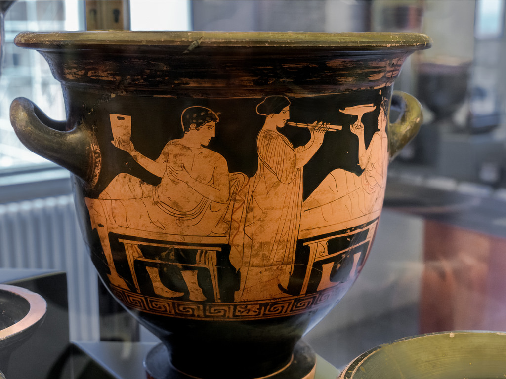
One of the most influential eras was the Greek era. When the Greeks conquered Rome, they changed the government - yet they appreciated the artwork and mythology that was previously there so much, they just renamed their gods and kept expanding upon their artwork.
The Geometric period from the Greek era was the first period to incorporate, as you may have guessed, geometric shapes with patterns into art and design. They first began this new concept of pattern making on their pottery, and the idea of only using one color to create a recognizable pattern was groundbreaking. Who knew that you could use negative and positive space in such a way? (The Greeks did, apparently!) This lead to the idea of using positive and negative space strategically: their “red pots” were just red pots that had black painted over them. The contrast between the color of the pot and the paint is what created the image...and also the primitive stages of positive and negative space!
One major outcome from the use of geometric patterns was the fashion industry. Modern clothes today are still using the concepts created hundreds of years ago. This discovery of being able to use only one color not only cut down on costs to create pottery, but has also become a design staple in our lives today.
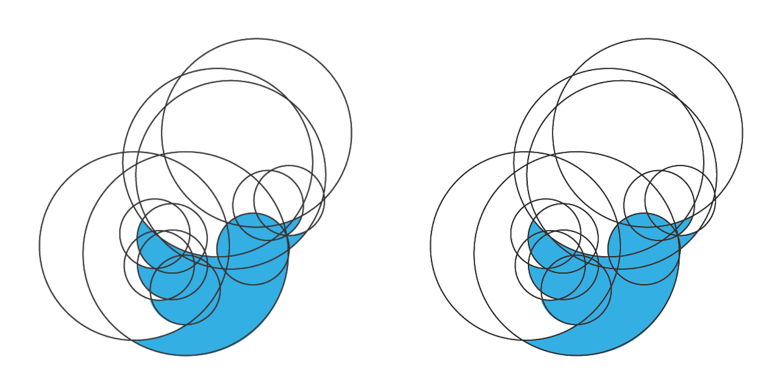
To reference a contemporary example, the Twitter logo can be perfectly divided into circles using the positive and negative space as well as the geometric grid basics. This is a very modernized example based on the principles laid out by the Greeks.
In the design world, the use of positive and negative space is a big factor in how we lay out our work. You will often hear designers talk about how their text needs “room to breathe,” in which case, they are referring to the negative space around the text. When designing, it is easy to clutter a page, which in turn makes the user feel claustrophobic when looking at your design. Without the idea of positive and negative space, the minimalist style may have never come around.
The use of positive and negative space has also influenced the way we print. Most of the time, when you visit a t-shirt printing site, they ask if it is a “one color, two color, etc. print.” This is because they have to layer in each color, one at a time. Again, we are taking very old principles created by the Greeks and modernizing them into today’s industries.
Proportions
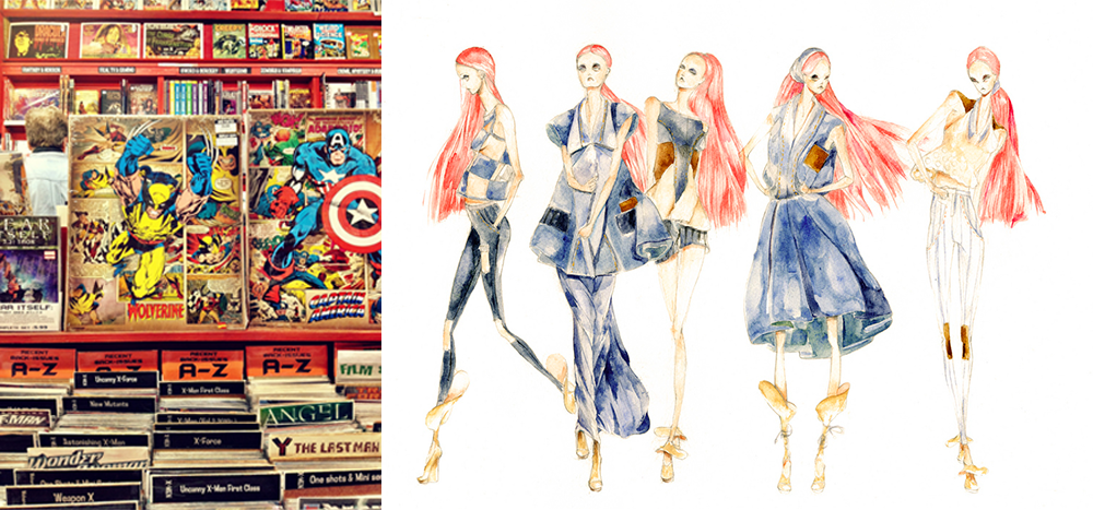
Are you a fan of comic books? Do you enjoy admiring the intricate details of superheroes? As a kid, I always noticed that superheroes really looked...well, super. What about fashion design sketches? Have you ever heard the expression “legs for days?” The models in these sketches are extremely tall and lean - clearly not based on regular proportions.
If you ever picked up on those things, it’s because they are drawn to a different scale than those done in Realism. Before the Greeks took over Rome, the style of their artwork was very different. The statues were stiff and made in a realistic style; however, they looked proportionally incorrect. How could this be? When the Greeks conquered Rome, they began rethinking how to put their own spin on Roman art. They came up with contrapposto (the more relaxed pose where one leg is bent at the knee) to give the body a more natural line, and they came up with the 6.5 head ratio for body proportions.
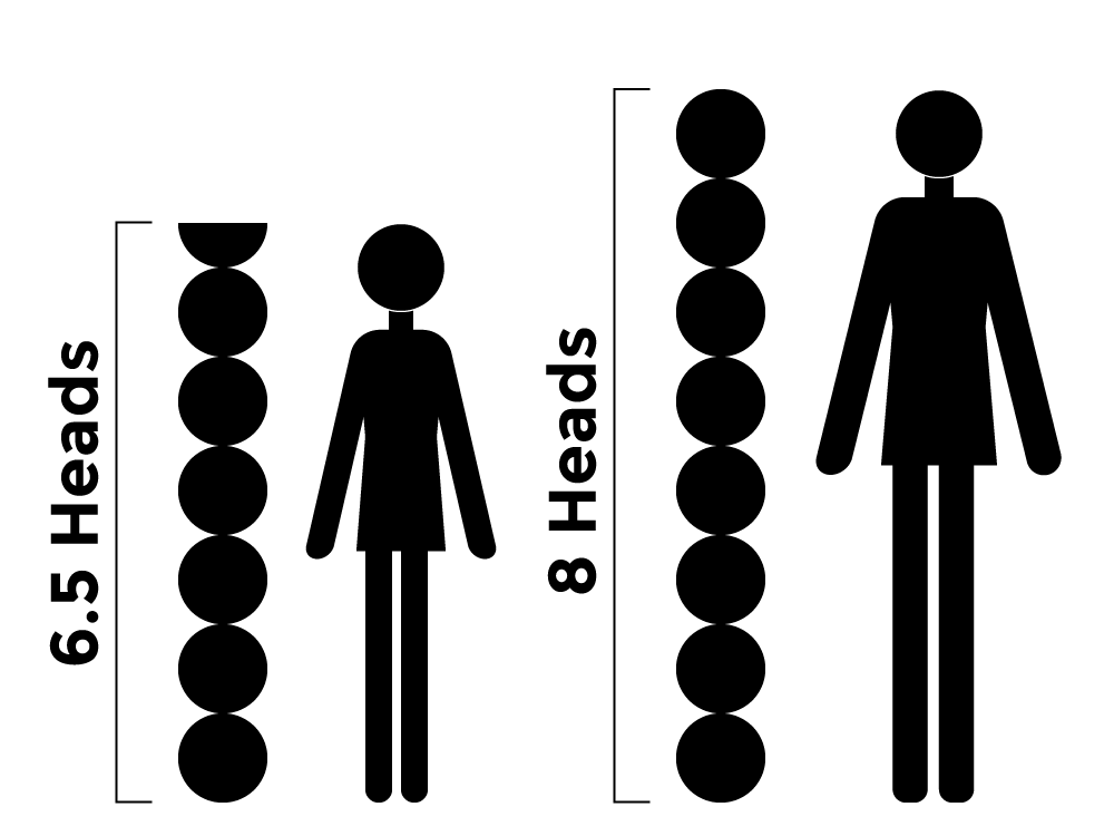
Soon they began sculpting their own statues, recreating works of the Roman gods. They used the rule of 8 heads to create larger, more idealistic body types, which influenced cartoonists’ superheroes today. Fashion designers also use the 8 head rule in order to make their models look more glamorous and bold.
By changing the stance to look more natural and creating a proportional system, the Greeks opened the floodgates to “super” human replications. We are still influenced today by ideas from ancient Greece and Rome.
Architecture
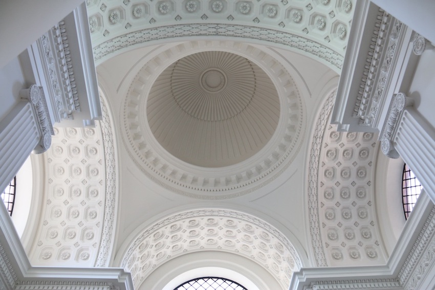
Have you ever been on a road trip? Do you remember passing over bridges? What about ducking under archways in order to stay dry? How many times have you driven under an overpass? You can thank Ancient Rome for your safe passage and shelter: Roman architects became the masters of domes and arches.
Before the Romans came along, architecture was getting repetitive. Most buildings were made to be perfectly rectangular, and every angle was sharp, which led to buildings looking alike. The Romans decided to test the idea of curving the lines to create more intricate, appealing, and stronger buildings.
Their efforts changed they way that we think about architecture. They made modern bridges possible. Could you image San Francisco without the Golden Gate Bridge? What about Japan without Kintai Bridge? The knowledge passed on from the Romans aided us in creating famous bridges, football stadiums, and some amazing cathedrals that are sprinkled all around the world.
Creative Freedom
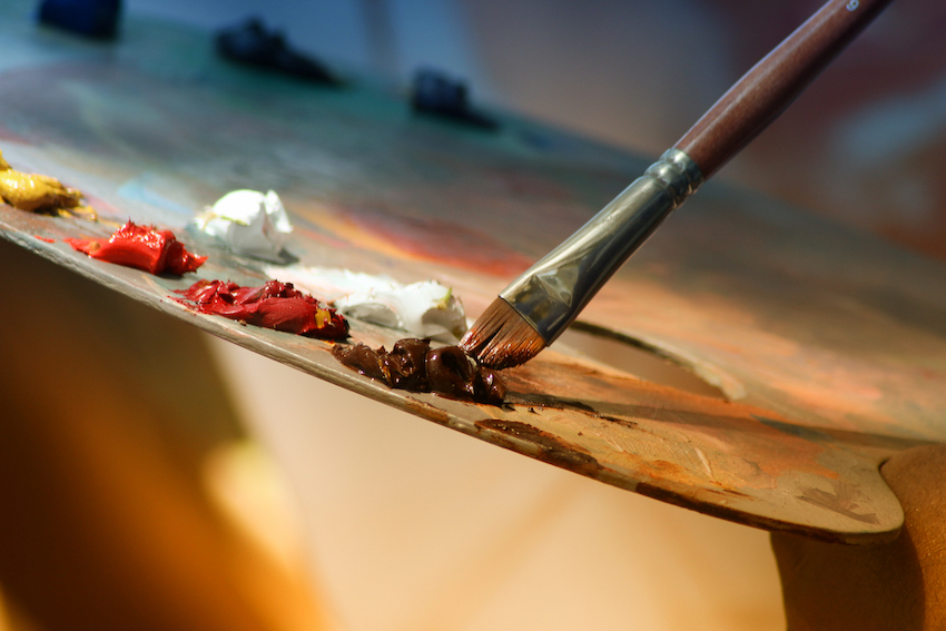
Art was flourishing for a long time - until one ruler came along and declared that artwork was banned. This was the beginning of the first Iconoclasm period. Iconoclasm is the Greek word for “breaker of icons.” This is also known as the Byzantine era. During this time, the ruler of the East destroyed artwork regardless of religious background. Usually, drastic measures like this were done for political gain and power. The most confusing part of this whole period was that, even though the land was divided into East and West, they shared the same church.
The East and West churches had very different opinions on the creation and preservation of artwork. The ruler of the East forbade the making of images, sculptures, and anything else that was original. Artists had to copy images of the past, and anything that seemed “new” was burned and destroyed. He also took down all religious depictions and replaced them with crosses. This era pushed creatives to their limits. They didn’t want to be bound to recreating old artwork; they wanted to branch out and try new things.
Meanwhile, artists in the West flourished. Their ruler loved the arts and believed that the visuals helped tell the story of their religious beliefs. He nurtured the art community until eventually artists began to break away from only creating religious artwork. This was the beginning of creative freedom.
Artists began to create more natural drawings and paintings - even the statues became less religious (although most statues are influenced by a ruler or religious event). Art slowly became more realistic to pass on the tales of time. This was the beginning of Humanism, an era that broke away from a focus on god to a focus on humans. Humanism allowed artists to explore the perfection of the human body, thus creating a more realistic depiction of anatomy. This era was the beginning of total creative freedom, allowing artists to create what they wanted rather than what was “allowed.”
Perspective
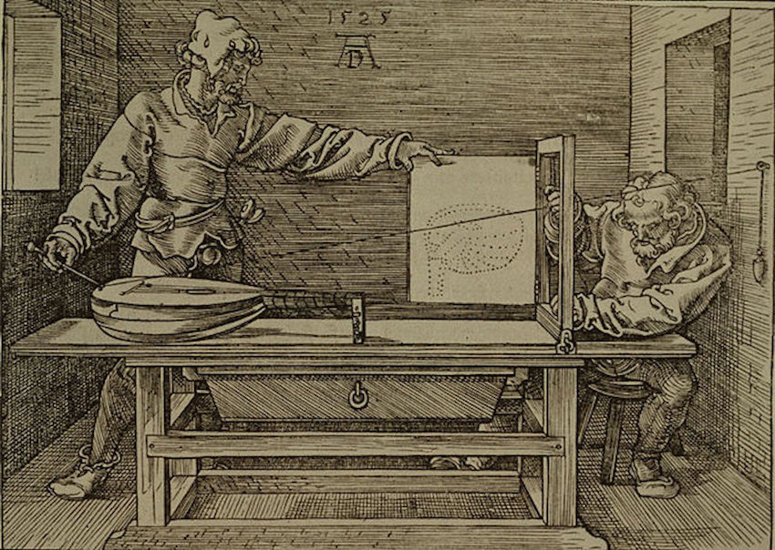
Linear perspective was discovered in the Renaissance period by Brunelleschi - who also built the dome for the Florence Cathedral (thanks to the knowledge passed on from the Romans). This discovery changed everything. Before Brunelleschi discovered how to measure perspective accurately, it was all a guessing game. This discovery revolutionized art as a whole! It allowed creatives to make proportionally accurate depictions of the world - both around them and in their imaginations.
Another genius of this era was Leonardo da Vinci (you’ve probably heard of him). Leonardo is responsible for the famous painting of Mona Lisa and The Last Supper - among other masterpieces. Both of these paintings are iconic today, and Leonardo actually used Brunelleschi's perspective theory to create the famous Last Supper. Without this discovery, who knows how successful that painting would be today?
(Leonardo also had a journal filled with inventions...what couldn’t this man do?)
The next era to come along was Mannerism. This styled created visual tension, also intentionally elongated bodies, and had unbalanced composition. Mannerists were pushing the boundaries of proportions; they wanted to use unbalanced compositions to convey their messages.
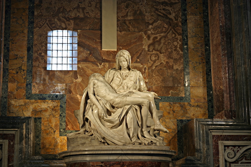
As a classic example, Michelangelo's Pietà has very odd proportions - it’s also the only statue Michelangelo ever signed, and boy, did he regret that move. Michelangelo carved this statue from one slab of marble, and he purposefully made Mary a giant in comparison to Jesus. This statue represents the moment that Mary took Jesus off of the cross, so Michelangelo wanted to show Jesus as someone very small and frail. In doing so, he made Mary appear much larger than what would be proportionally accurate. He knew that conveying the right emotions for viewers was more important than creating a proportionally accurate statue. He also wanted Mary to appear larger to show that Jesus was safe in her arms: she was holy and powerful.
Without these artists pushing the boundaries, we might not have a lot of the playful layouts and abstract styles that came from those eras.
Conclusion

Art is a living, breathing form of communication that will never stop evolving. We use visuals to help people learn, to relieve stress, to bring joy to our daily lives, and just because it looks “cool.” Could you imagine a world without art? What about a world without design? One could not live without the other. Cultures around the world are constantly influencing each other to keep thinking outside of the box.
We now have a better understanding of the main principles for creation. We understand the use of positive and negative space. We also have a better handle on proportions, allowing us to play with crazy extremes, like a mouse having really big feet, or a superhero with giant hands (that reference was for you, Disney fans). Art has allowed us to discover the importance of perspective, allowing us to create worlds that don’t exist. Design will always be influenced by artists and vice versa.
How will you modernize design and art today?


