You have a website for one key reason: to convert leads into customers.
What is the fundamental element that closes the deal?
The calls-to-action strategically and meticulously sprinkled all over your site.
A call-to-action, simply put, is a method in which select words are used to prompt a user to complete an immediate action in a sales setting, either online or in print form.
Though the definition of a call-to-action (or CTA) sounds easy enough, getting the most out of the ones you create for your website takes effort, so let’s walk through:
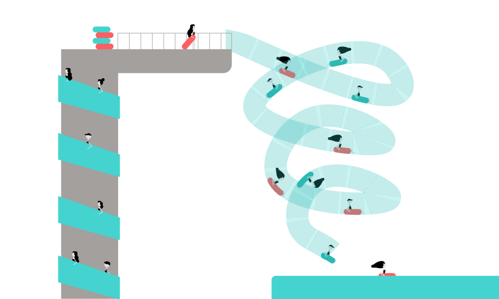
CTA Core Elements
Because your intention is to get a user to convert into a customer, your CTAs, above all else, must provide value or coercive reasons to purchase immediately.
The goal that businesses strive to achieve with CTAs is to invoke an action from a user that starts them down the purchasing funnel: making a purchase, registering an account, signing up or otherwise filling out a form, or downloading something of value to them. The process also helps a company collect important customer information to see if their CTAs and the offers behind them are getting to the right people at the right time.
For best results, there should be a CTA on almost every page of your website—as long as the CTA is relevant to the content on that page. An important note: if you have a landing page with an offer, do not add additional CTAs to said page since it can distract users from the primary goal of the offer.
All successful CTAs have at least one thing in common: they use imperative verbs, either in the form of a command or, more gently, request. These verbs not only inform the user of what their next step entails, but they also help to inspire a reaction if they are convincing enough. Some examples of imperative verbs used in CTAs include: download, shop, start, stop, grow, build, join, get, learn, discover, save, want, need...you get the idea.
Structurally, offers and websites usually have a series of smaller CTAs that then lead up to one big one that requests a certain action from the user. This helps to provide alternative actions or paths to the offer that the user could take - and increases the chances of converting.
While using CTAs online has triumphed over using them in print, they could still be found in brochures, catalogs, flyers, and magazines. The desired action usually is to visit the related website, or perhaps contact the company the old-fashioned way (do people still use phones for calling? My non-research-backed observations say no).
Online CTAs usually appear in banner, button, graphic, or text form, and they are virtually everywhere—and anywhere. Here, the goal is to get a user to click and continue down the conversion funnel. CTAs are essential to inbound and permission marketing as the whole point is to provide users with value in anticipation that they’ll choose you for the job they need done.
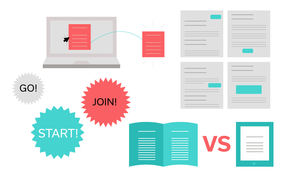
Dynamic CTAs, where the user’s browsing history, data, and interaction with a company generate personalized CTAs for that particular user, are the most effective at targeting exactly the right people due to their heightened specificity.
There are a few techniques for CTAs that have been tried and tested, so let’s dive into the most common strategies and how to properly execute them.
The simplest technique is to straightforwardly focus on the benefits your offer has for the user. If what you have to offer is a great fit and useful for the user, highlighting this information from the bat is both efficient and effective.
Beware if your goal is to collect more detailed lead information, however, since such forms are rarely perceived as being super easy to fill out—and therefore should not be promoted as such.
A similar technique is what I call the “why not?” method: if your copy expresses that users have nothing to lose and something to gain, so what’s the worst that could happen to them, they’re less apprehensive to give your CTA a click. After all, why not click it?
Many times, CTAs rely on immediacy or time limits to close the deal, and this is usually present in one of two ways. Either the copy uses urgent phrasing, such as “now” or “hurry,” or an actual time constraint is emphasized—usually as a countdown clock-like timer or some type of “due date” for the user.
Many times, users are intimidated by the idea of purchasing products or services without giving them a test run first, which you can use to your advantage: reducing risk or obligation with a free trial or demo, complete with a guarantee of sorts, is a solid way to tackle the commitment issue. Like most moms tend to say, “try it; you’ll like it!” Moms already know that this strategy works like a charm, and now you do, too.
Alternatively, consider adding a video tour to get potential customers accustomed to the product or service before they have to fully commit. This also lowers the learning curve and builds trust by allowing customers to get a good preview before purchase.
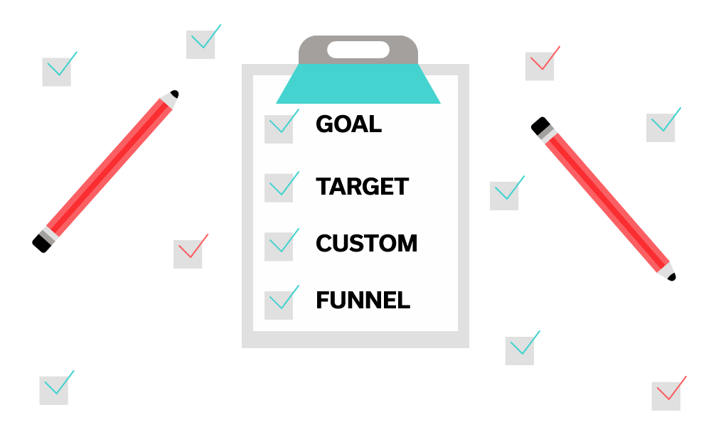
Planning Your CTAs
The point is to complete a specific goal by converting a lead into a customer, so first and foremost, remember to ask yourself, “what are we trying to achieve with a click?”
The second half of this step is identifying your target market and verifying that the majority of visitors to your site (that convert) fall into your ideal customer range.
Then, you must identify where your user is in the conversion funnel and style your CTAs accordingly. If users are in the TOFU (top of the funnel), try offering freebies and downloadables, such as e-books or icons. The MOFU (middle) users are more aware of your company, and so customer reviews or webinars explaining the product or service would be appropriate to offer. The BOFU (bottom) users are almost ready to purchase, so nudge them along by offering a discount, free trial, or demo behind your CTA.
Remember when we touched on dynamic CTAs in the beginning? These especially come in handy on blogs: using the buyer persona and data on the user herself, you can personalize a CTA to be more relevant to the reader. Imagine if you were reading an article about evergreen content and an offer came up for a webinar about writing better and longer-lasting blog articles—you would be more likely to click it than if the webinar were about typography, right? Right.
In order to properly and tastefully place CTAs all over your website, first, map out every page that exists with the corresponding stages of the sales cycle. That way, now and going forward, it will be easier to know where to place which kind of CTA on your website.
It would also be valuable to combine your industry knowledge and website analytics to determine who visits which pages, and gain insight into where, when, and how new and returning users browse your website. Tracking conversion assists—or pages viewed by a lead before turning into a customer—help you identify pages that are ideal for awareness stage CTAs.
How to Test Your CTAs
It’s super important to test your CTAs to make sure they’re yielding the results they should, but it’s also tricky: though you can come up with a conversion rate formula that calculates the number of clicks versus the number of times the CTA was viewed, this takes analytics data combined with internal company goals - and a lot of work.
A simpler method is by A/B testing elements of your CTAs—one factor at a time, of course. In the next section, we’ll cover elements of your CTA that you could optimize, but for every small change you make, remember to test and compare the results.
Ultimately, there is no secret formula or template for the perfect CTA; you just don’t know what will work until you try it out.
There is no secret formula or template for the perfect CTA; you just don’t know what will work until you try it out.
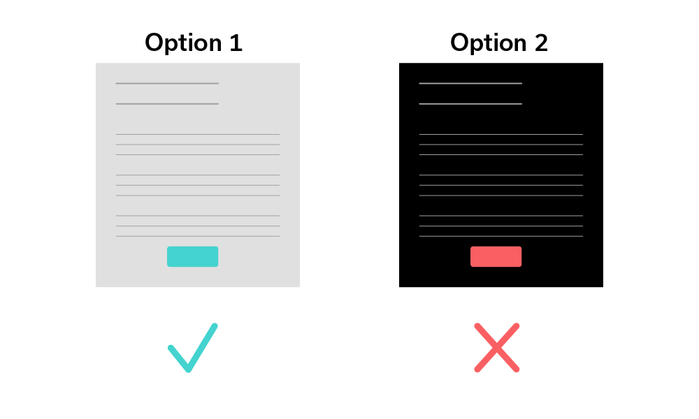
How to Optimize Your CTAs
There are 5 key elements to every CTA that you can optimize to get the highest conversion rate possible—but remember, change only one specific part at a time to accurately track what is more or less effective.
Color
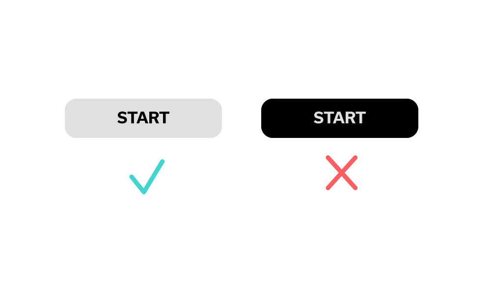
The color usage in your CTA is meant to grab users’ attention—and, unlike your instincts tell you, it doesn’t necessarily have to look pretty.
If the color scheme on your website is very particular and consistent, creating a CTA with a button in the same color scheme may drown out the offer and result in missing out on conversion opportunities. If, for instance, a website has a very pastel color scheme, a bright red button—though clashing with the palette—will definitely attract a user’s eyes right to it.
Format of offer
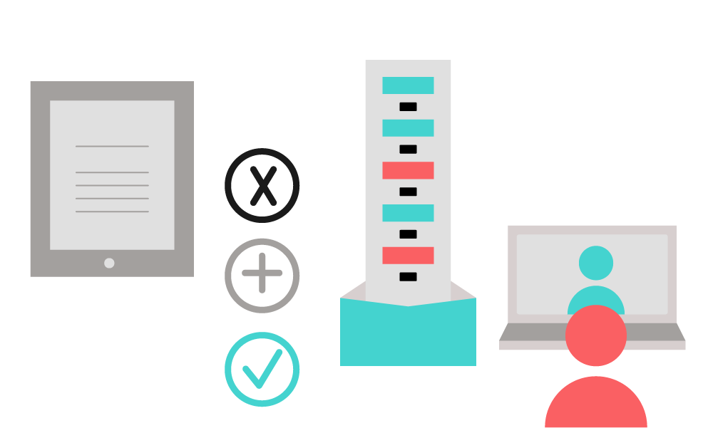
The format of the offer is important to note too, as some occasions mandate more information or form-filling from the user than others. Usually, the format falls into one of two categories: downloadables—like e-books, templates, icons, or tools—or sign-ups for newsletters, demos, webinars, or events. If users have low conversion rates on one format, try a different style and test it until you find success.
Size
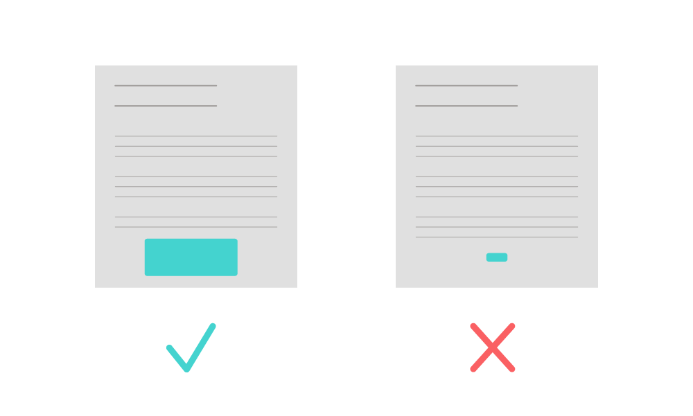
The size of your entire offer, CTA button, text, and additional images all matter. If you have an extremely tiny “download free guide” button on the bottom of a page, will anyone notice it?
If you find that people aren’t clicking the button, test a larger size. The button absolutely must grab attention, so it cannot be insignificant in any way - it’s commonly the actual part that users click, after all. Make sure that the shape, colors, filling style of the button, as well as the quantity of buttons and their proximity to each other are all optimized.
When planning your CTA button sizes, always check how they display on desktop and mobile - after all, mobile internet usage officially surpassed desktop in 2014, so it’s crucial that your CTAs display well on all devices.
Word Usage
Depending on who you ask, many marketers may argue that the most important element is the copy itself—while graphic designers may tend to disagree, I suspect it’s because of job-related bias.
First, you must decide if your CTA will be mostly text or image-heavy. This limits the amount of information you can pack into the offer, which can get tricky when your product or service takes more than 4 words to explain.
Though it’s tempting to be edgy and turn heads with a shocking headline, you must remember to be specific and clear above all else. If a user sees a cool graphic with an alluring headline but doesn’t know what it’s for, he may experience some distrust or confusion and shy away from clicking the CTA.
It’s important to come up with different copy for every CTA and test it—always ask, “how many ways can you say this, and which is best?” Make as long a list as you can of solid ideas, then A/B test them to find the best fit. You’d be surprised: sometimes the one that you find most catchy may be the least effective—and vice versa.
Though it varies depending on your end goal, consider how many fields there are in your corresponding form. If there are too many fields with too specific or difficult of questions, even though you’d collect data gold from that final click, users may be simply too lazy or busy to go through with it. No conversions, no gold, no good. Consider the minimum amount of fields you would need, if any, to get the data you need, then test it out to see if users agree.
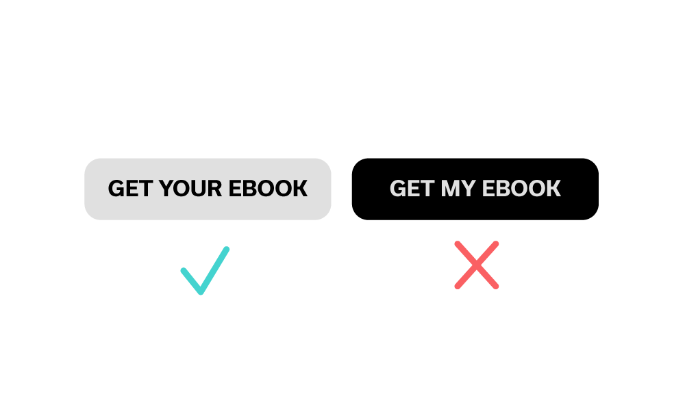
Finally, with choosing the right words to convey the right level of excitement and value, it may be beneficial to use more personable language. Using “your” or “my,” such as, “grow your network today” may feel, on the user’s end, like you care about them and their situation specifically.
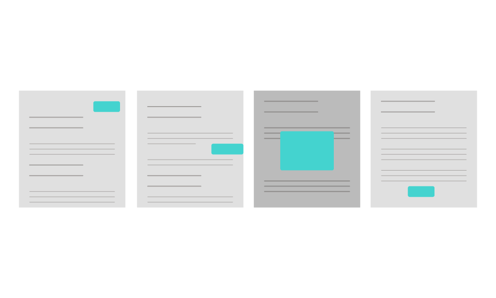
Location
Finally, where will your CTA reside?
The safest bet is the top of the page, where users will see it first, and even if they bounce from your site in a short while, they may still give the CTA a fair chance because it’s impossible to miss.
While pop-ups are seemingly everywhere, this may not be the most effective placement for most common situations: they’re not popular with users due to being disruptive, especially when they’re full-screen and require some sort of action—or guilt trip—to go away.
If you had a retail site, for instance, and a user visits for the first time, a pop-up that requires an email address to get a discount (or else!) may cause the user to bounce because she hasn’t had a chance to get to know the brand yet, and therefore doesn’t know if she’d use the coupon anyway.
Plus, people are wary of getting arbitrarily added to an email list in that way, so use pop-ups wisely and with extreme relevance. (Bonus: try a dynamic and pop-up CTA for best results.)
The bottom of an article is a good idea, but moreso on shorter articles - according to Chartbeat, a traffic analysis company, most visitors only get through 60% of an article. With that in mind, users may never even see your super awesome bottom-of-page CTA after a long article, so practice caution with this strategy.
As Hamlet sort of said, “to move or not to move.” This can be very helpful or harmful: many users have become accustomed to glazing over static images with offers, so motion is likely to engage those users more by catching their eye.
However, these CTAs can also be irritating and don’t ask for permission from the user, so it’s important, for the hundredth time, to test this against an alternative.
CTAs that slide in halfway through the article are the best of both worlds: they’re on the side and wait so they’re not intrusive, but the movement is still catchier than a static image or text block.
Now that you know all the basics of CTAs, it’s time to make your own! If you need some inspiration first, check out these CTA examples that are the perfect balance of actionable and attention-grabbing.
Good luck, and remember: plan, test, optimize, test, convert—oh, and then test a little more.


